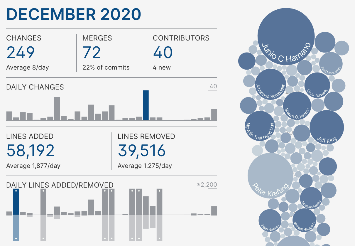
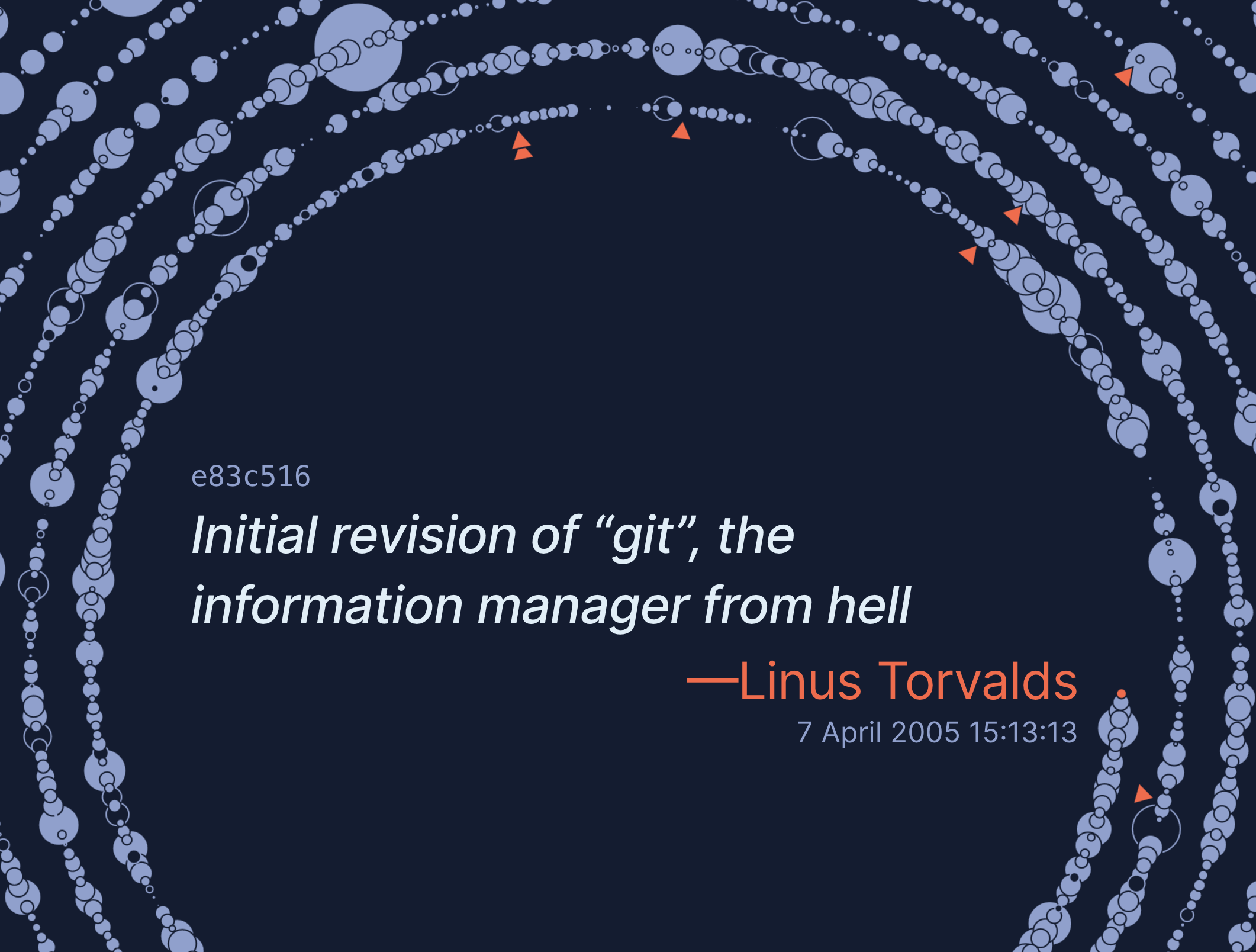
Posts in svelte

The 2013 Felton Volume Chart

This final post in my series on how I created the visualizations in my Visual Studio Code 2020 Year in Review covers how I recreated the "volume chart" from Nicholas Felton's 2013 Annual Report.

By Jeff Palmer in Case Studies

March 30, 2021 • 11 Minute Read

Visualizing the Change History of the Git Repository

Recently I decided to continue my experiments visualizing the data produced by the software development process. This time I decided to dig into the git commit history of Git itself, with the goal of creating something interesting and creative that still provides information about the subject matter.