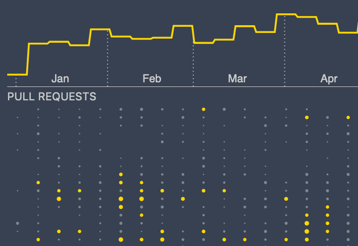
The 2013 Felton Volume Chart
This final post in my series on how I created the visualizations in my Visual Studio Code 2020 Year in Review covers how I recreated the "volume chart" from Nicholas Felton's 2013 Annual Report.

This final post in my series on how I created the visualizations in my Visual Studio Code 2020 Year in Review covers how I recreated the "volume chart" from Nicholas Felton's 2013 Annual Report.

Recently I decided to continue my experiments visualizing the data produced by the software development process. This time I decided to dig into the git commit history of Git itself, with the goal of creating something interesting and creative that still provides information about the subject matter.
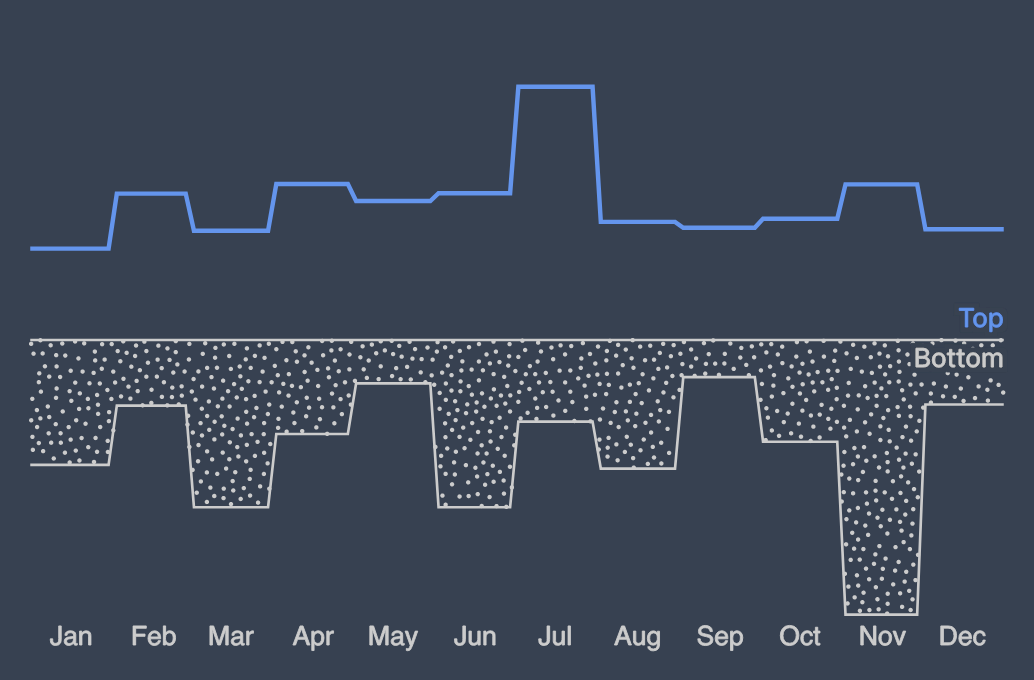
Using D3 and Svelte to implement the second variant of the Felton 2013 histogram.
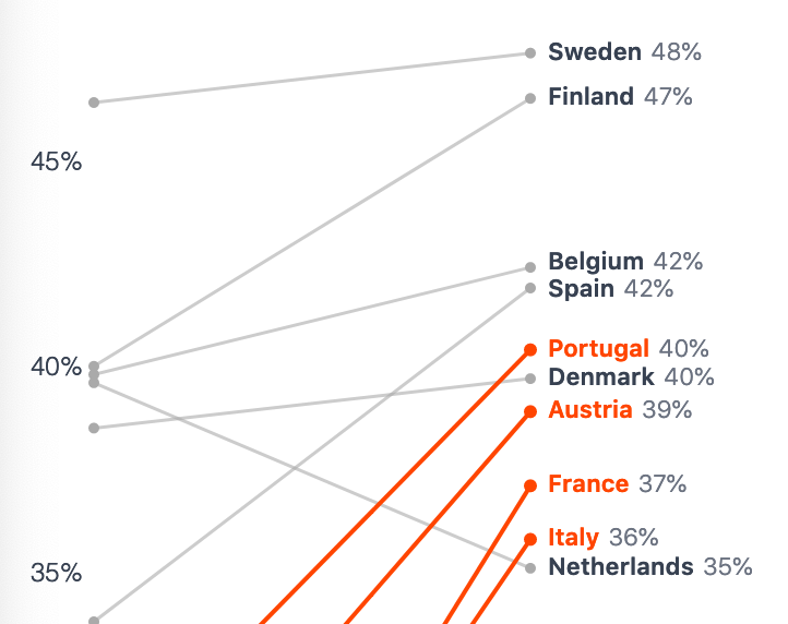
I decided to make another visualization for last week's MakeoverMonday, but this time I used a slope graph.
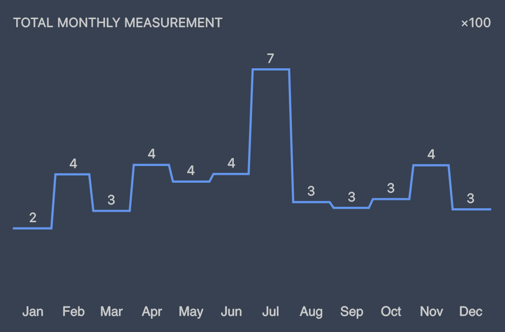
Using D3 and Svelte to implement the first variant of the Felton 2013 histogram.
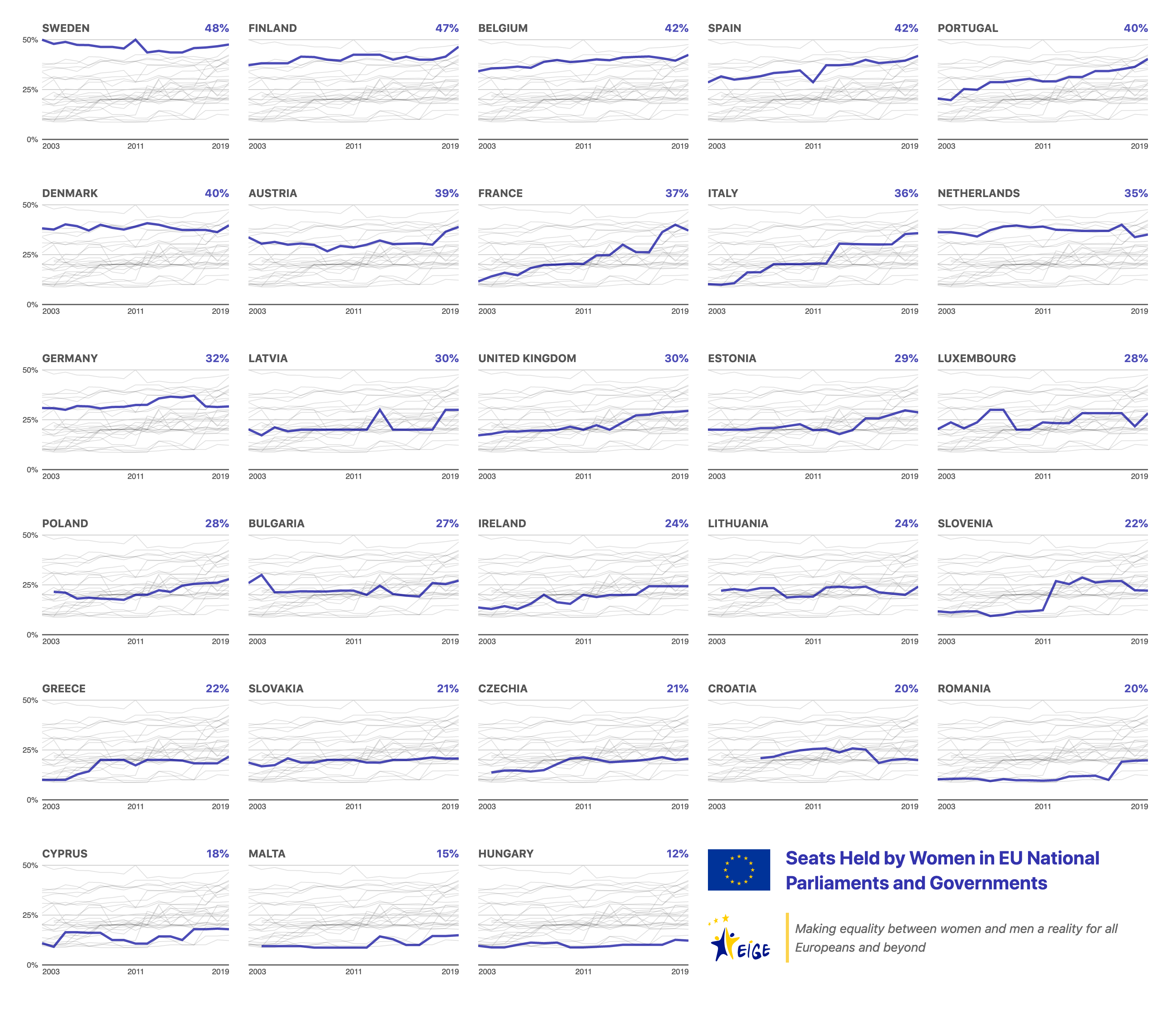
My submission for MakeoverMonday 2021-W9: Seats Held by Women in National Parliaments.