Harmonium is a long-form generative art project released on fxhash on 30 June 2022. I worked on this project over the course of several months, and it’s my largest project to-date. This blog post describes the project in detail, from my inspirations to the technical issues I encountered while building it.
Why Harmonium?
As I was developing this project, I realized that I wanted to explore the varying relationships of shapes and forms. This exploration reminded me of the Wallace Stevens poem “Thirteen Ways of Looking at a Blackbird,” in which a blackbird acts as a point of reference for the study of thirteen different themes.
I eventually incorporated this structure directly into the project, providing thirteen different types of generative layouts, so I thought it fitting to name the project accordingly. “Thirteen Ways of Looking at a Blackbird” was published in Harmonium, Wallace Stevens’ first collection of poetry. I thought the word “harmonium” nicely suggested the harmony of forms I was pursuing (even though it’s actually defined as a “reed organ” 😝), while also acting as an homage to Stevens, so Harmonium it was.
How it Started
After the release of Dissolution, I started working on a new project idea that involved the generation of realistic city maps. I knew basically nothing about how to do this, so I started to research existing approaches. I eventually found Interactive Procedural Street Modeling, which describes how to mathematically represent a street network. This representation can then be displayed using an algorithm documented in Creating Evenly-Spaced Streamlines of Arbitrary Density.
Streamlines are frequently used to visualize “flow” in a field described by differential equations. This second paper describes how to generate evenly-spaced streamlines and includes an efficient representation that can be used to test for streamline intersections. This seemed like something that I should understand at a fundamental level, so that’s where I started.
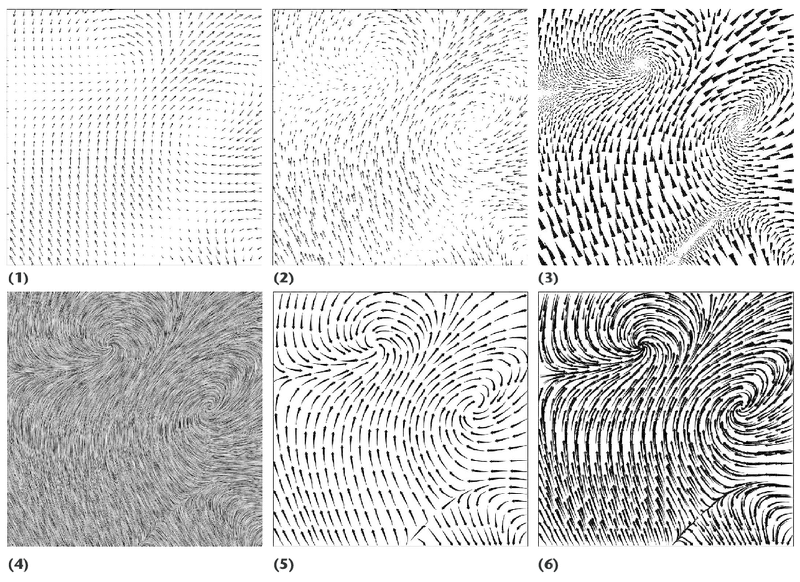
An example of streamline visualizations in scientific literature (David Laidlaw, Brown University)
The core algorithm works by integrating over a vector field - incrementally tracing a point along a set of vectors until it intersects with an existing line or it moves out of the display field. This new streamline is then used to calculate possible starting points for other streamlines. Because of this, the position of each streamline depends on the streamlines that came before it.
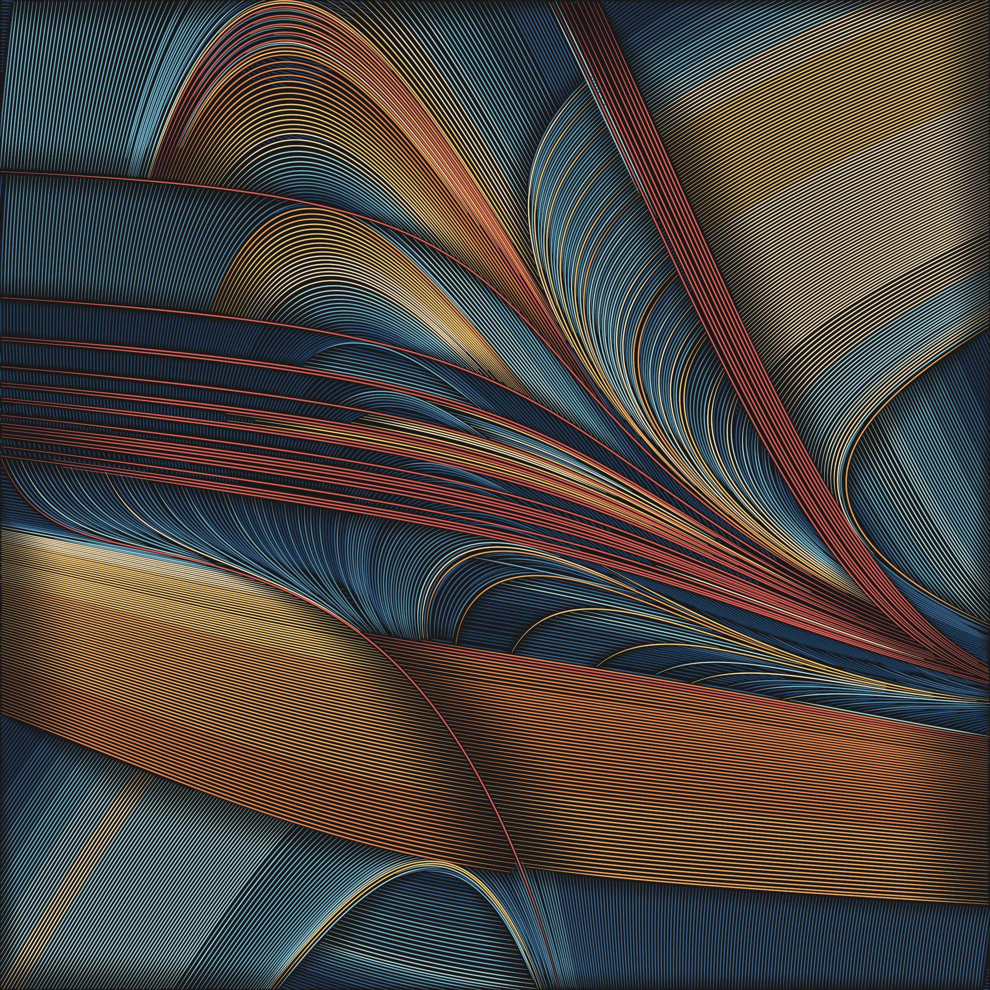
The street modeling paper introduced a way to calculate perpendicular streamlines at all points (for easy generation of street intersections) using tensor fields and eigenvalues/eigenvectors. (Here’s a great video explanation of eigenvalues and eigenvectors from Grant Sanderson.) While experimenting with these fields of perpendicular streamlines, I realized that if I periodically (or randomly) swapped the major/minor streamline directions during plotting, very interesting images would result. It was at that point that the core Harmonium algorithm was born.
The very first Harmonium image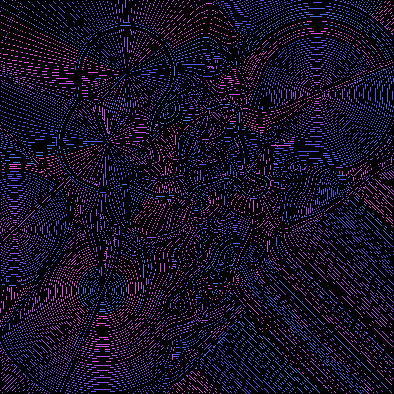
At that point I thought I had the basis of an interesting project, it just needed to be developed. I started by tapering the streamlines so that they were thinner at the ends than in the center. I also scaled the maximum streamline thickness based on its overall length, so that the longest streamlines would be thicker and have more presence.
The first tapered streamlines (detail)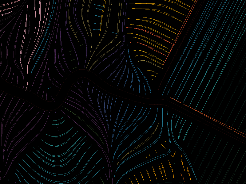
At that time I was working in Julia (my preferred prototyping environment) and generating pixel-based images. I had hacked together a set of tools that operated at the pixel level, but I didn’t have any way to fill in curves and other shapes. Rather than implementing a polygon filling algorithm, I decided to start generating SVG (Scalable Vector Graphics) images directly.
SVGs are resolution-independent vector image representations that can be displayed at any zoom level across devices. They are also easily plotted with a pen plotter, which was a secondary goal of mine. However, by far their most important property is that they don’t display pixel-based artifacts. The following two images show the difference between a pixel-based rendering and an SVG.
A comparison of the first SVG output with its pixel-based original (left)![]()
It was then I decided to convert my Julia code into Typescript to create a long-form generative project that would be focused on exploring interacting forms.
Interacting Forms
So, what exactly do I mean when I say that Harmonium explores the relationships between different forms, and how does that work?
Internally I represent different types of forms via their mathematical definitions in a two-dimensional field, and each field can have a major or a minor direction (which are always perpendicular to one another).
For example, in the table below there are two different fields: sin(x)*sin(y) and Worley noise. Across the top and left are the major- and minor-only representations of these fields (where streamlines have been constrained to flow only along the major or minor directions). The images inside the table represent the result of combining the field/major at the top with the field/major on the left. The fields are mixed by assigning a weight based on the y coordinate, such that the field on top is strongest at y=0 (the top of the image), and the left field is strongest at y=1 (the bottom).
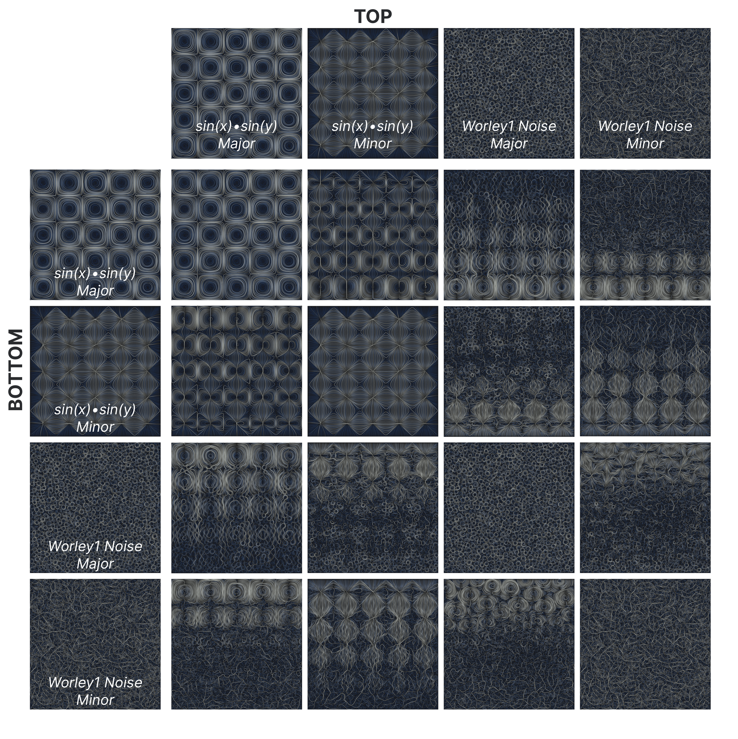
As you can hopefully see from these images, each field exerts an influence upon the other, which causes the fields to appear as if merged. By changing the way that the weight for each field is computed, many different types of interactions can be created.
The following image is the same set of fields and weighting functions as in the table, but with all major/minor directional constraints removed and with periodic switching of major and minor directions enabled (which is the default Harmonium algorithm).

Form Types
Harmonium contains several different forms that can be combined:
- Radial (infinite circular field)
- Grid (infinite grid field)
- Noise
- Simplex
- Fractal Brownian Motion
- Warped
- Turbulence
- Worley (1, 2, 2-1, Smooth)
- Quantized (a variant that I created that adds grid-like curvature constraints to a field)
- Mask (alters the strength of another field)
- Signed Distance Functions (SDFs) (finite circles, triangles, and rectangles)
- Scalar fields
- Vector fields
Each of these fields can be further modified via different weighting functions that determine how much of an impact they have on their neighbors:
- Constant: the field has the same weight everywhere
- Exponential Decay: the field weight decays according to an exponential decay function, similar to how light grows dimmer the farther away an object is from the source.
- Inverse: The weight of a field is the inverse of another field. This makes it possible to have hard edges between fields.
- User Defined: Any other function can also be used to create other various effects.
An Example
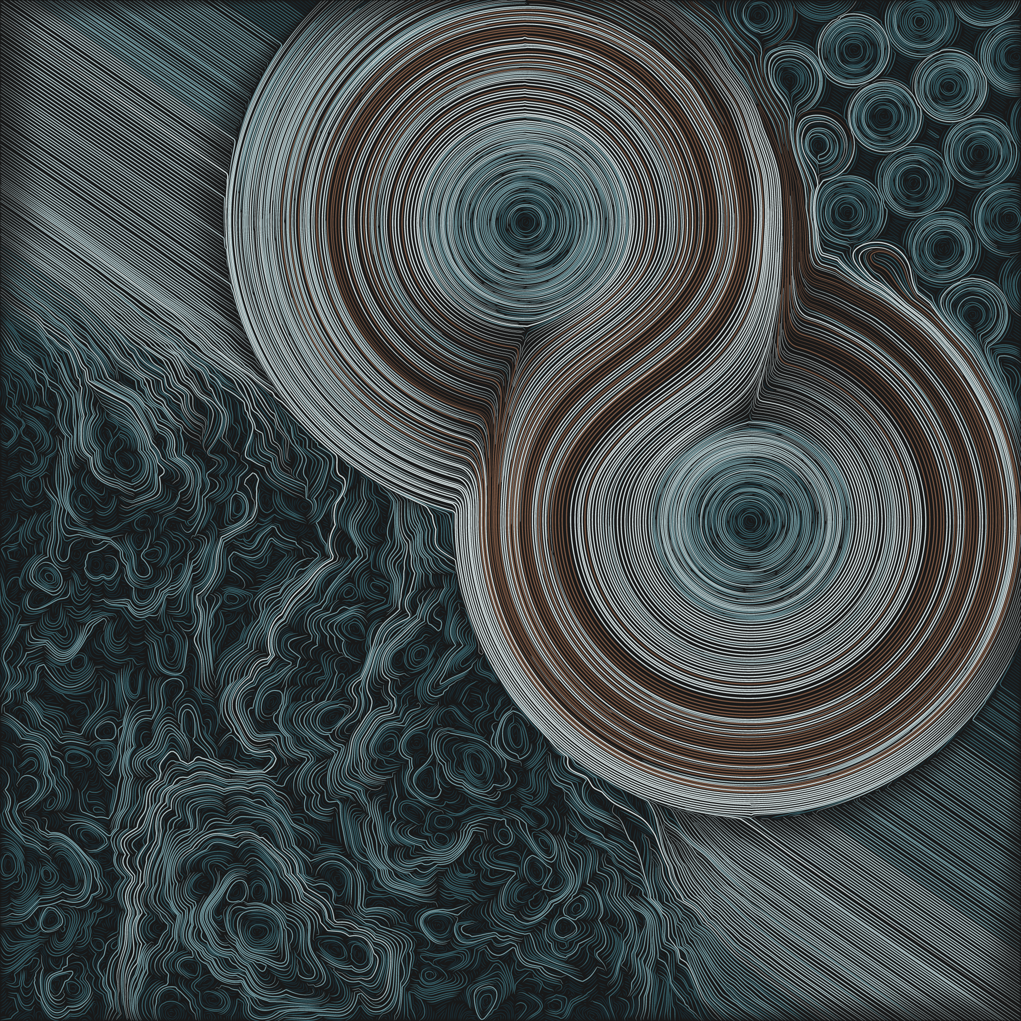
Harmonium #167 is a good example of some of these forms and how they can interact. It contains the following:
- Two radial fields near the center
- A Mask field in the lower right that alternates between circles and the underlying grid field
- A Fractal Brownian Motion field in the upper left
- A Grid field in the upper right
All of these fields (except the grid) use an exponential decay weight function, so their interactions change based on how close to one another they are. On the right side of the image you can see the interaction between the mask, grid, and radial fields as the larger radial field is disrupted by the smaller circles formed by the mask.
Harmonium #167 - An example of interacting forms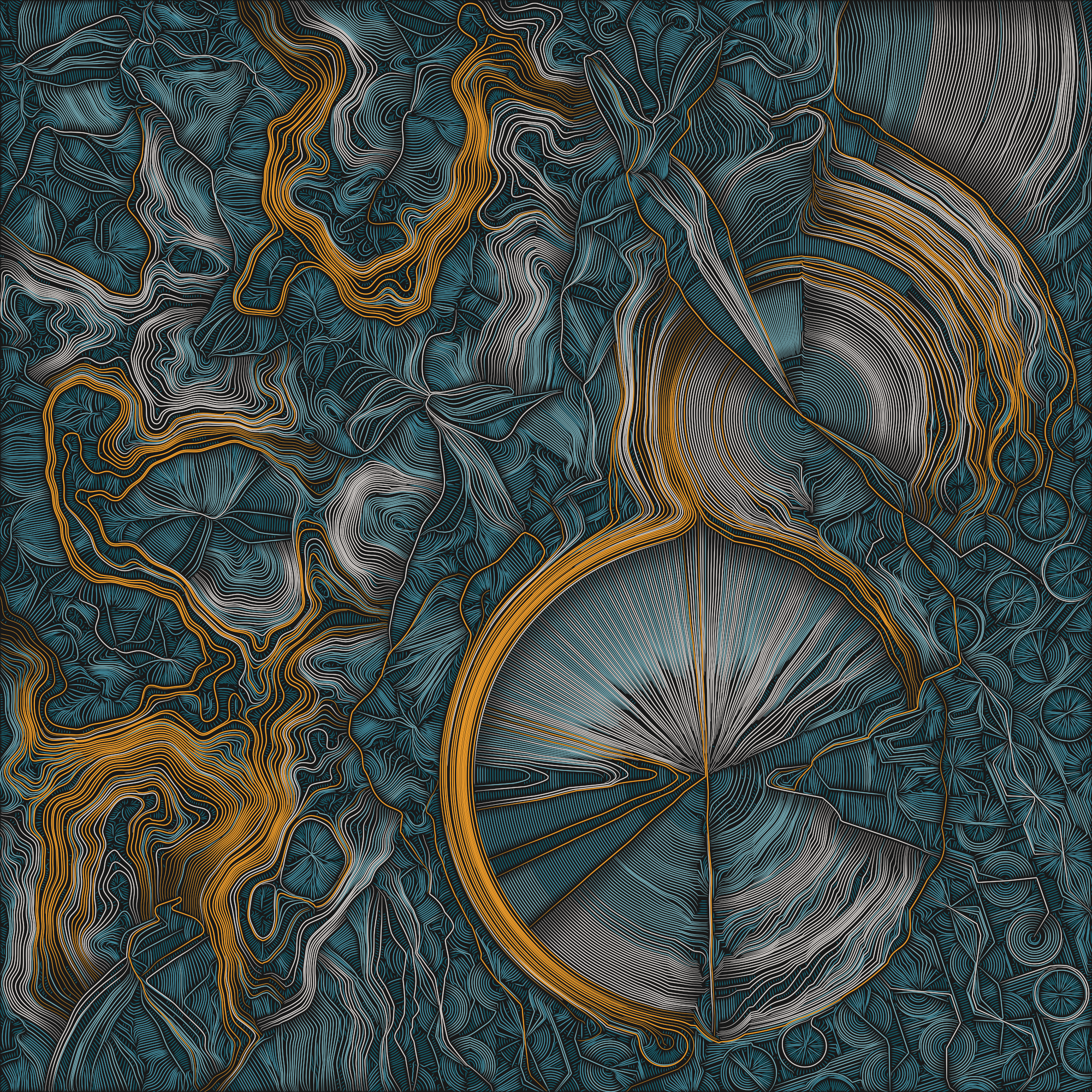
Further Refinement
One important aspect of long-form generative art projects is that their outputs need to simultaneously exhibit variety and similarity. Images should be similar enough that they are obviously related to the broader set of generated project images, while at the same time being interesting in their differences. This isn’t an easy balance to strike. Kate Compton nicely describes this issue in her essay “So you want to build a generator…”:
I like to call this problem the 10,000 Bowls of Oatmeal problem. I can easily generate 10,000 bowls of plain oatmeal, with each oat being in a different position and different orientation, and mathematically speaking they will all be completely unique. But the user will likely just see a lot of oatmeal.
Nobody wants to see a lot of oatmeal. We want interesting aesthetic variety, and achieving that is the challenge of long-form generative art.
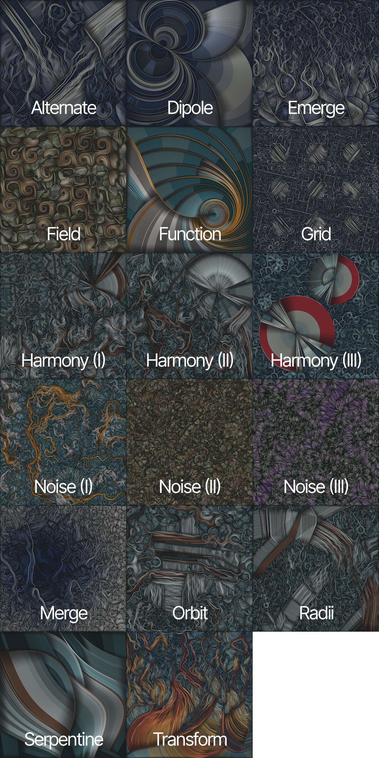
My first attempt was to try to create a completely randomized layout of forms, which sort of worked. Unfortunately I had a lot of different ideas that I wanted to explore, and trying to fit them all into a single “do everything algorithm” was making it a real challenge. That’s when I realized that this process would be easier to manage if I created several specialized layout “types” that were variable yet constrained in their own ways.
I spent several weeks exploring different variations, and ultimately ended up with 13 different types of layout, some of which contained several sub-types that explored specific aspects of the initial layout. These are as follows, with a representative image selected from the set of 350 fxhash outputs:
Color Palettes
Working with color palettes and color assignment algorithms easily consumed the majority of my time during the final weeks of development, but I’m happy with how these turned out.
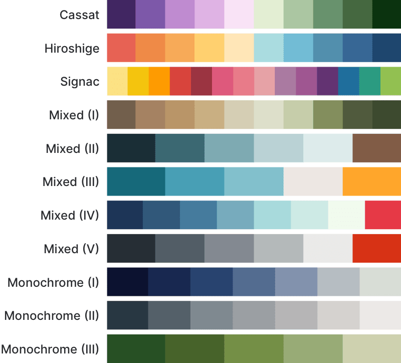
Each of these color palettes can be applied in a variety of ways, determined by the application of a specific color assignment algorithm.
Color Assignment Algorithms
While experimenting with different layouts I started to imagine different ways of assigning colors to streamlines. I wanted to be able to assign colors based on streamline length or curvature, while also being able to constrain colors to a certain percentage of the overall image to avoid situations where a single color becomes overwhelming. With these goals in mind, I ended up with the following set of algorithms that assign colors by:
- Groups of equal size (number of streamlines), based on streamline curvature or length
- Groups of equal visual area, based on streamline curvature or length
- Groups based on streamline distance from a single position
- Groups based on distance and angle from a single position
- Groups based on distance from a line segment defined by two positions
One downside to these algorithms is that they need to be able to look at all of the generated streamlines in order to calculate boundaries for different colors. This means that they have to be applied only after the complete image has been generated.
Since that process can take a while, Harmonium uses a placeholder color assignment algorithm during initial image creation. Once all streamlines are placed, the necessary information can be passed to the different color algorithms to choose a final color mapping. This is why streamlines have one set of colors while they’re being created, and another set of colors once all of the streamlines have been drawn and the final SVG is displayed.
One other interesting aspect of this process is that these color algorithms are not applied randomly. A list of algorithms is generated for an image which are then tested, in order, against the full set of streamlines. If an algorithm applies colors in a way that isn’t “balanced” (according to an internal definition), it is discarded and the next one is tried, until eventually an appropriate color application has been determined.
This approach made it possible to have color palettes with strong highlight colors that don’t overwhelm the other colors in an image, while still providing a variety of different ways of coloring an image.
Happy Accidents
One of the visual elements in Harmonium that many people have commented on is the depth and shading of the streamlines. This was definitely a happy accident! This effect is an optical illusion that’s the result of combining a black background with closely-spaced tapered lines. This wasn’t something that I was trying to do, but I was happy to keep it when I saw the effect.
The appearance of moiré in certain Harmonium outputs is a similar accident. Because SVG is a vector format, it tries to represent very fine lines as accurately as possible, which can often interact with different display technologies creating a strong moiré effect.
Plotting
After the acquisition of my AxiDraw earlier this year, I’ve increasingly wanted to “go physical” and plot outputs from different projects and experiments. Harmonium was no exception, and so I built in support for plotting from the beginning.
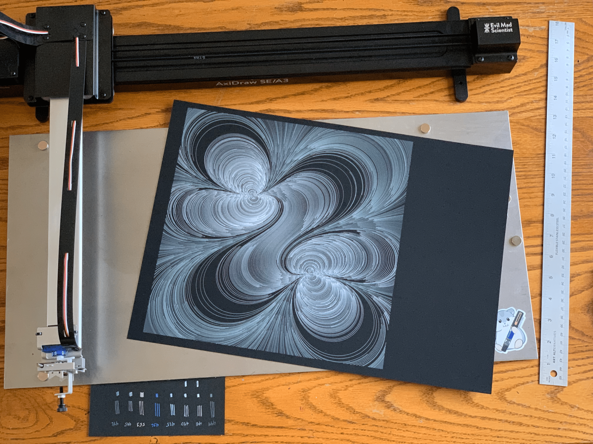
First of all, generating SVGs almost makes this a freebie, but there were a couple of things that I added to make the process as easy as possible.
- Tapering can be enabled or disabled by pressing the ’t’ key while in full-screen mode. Because the tapering algorithm generates two nearly identical paths that are joined at the ends, these two paths can be problematic during the plotting process. Disabling tapering and exporting an un-tapered version makes the plotting process much cleaner by generating a single path for each streamline.
- Each color in separated into different Inkscape-compatible layers. This makes it straightforward to change to different pen colors during the plotting process. I have regularly used Gelly Roll Moonlight 06 pens to plot Harmonium images using these layers, and the process has worked pretty well.
- The background is in another layer, so that you can choose whether or not to plot the background frame.
However, there were some things that I wasn’t able to include that require a little explanation:
- Paper size is not included in the exported SVG. You’ll need to do some manipulation in Inkscape (or your favorite plotter support package) to prepare an image for plotting.
- There are no borders in the SVG, so you’ll need to factor that into the plotting process.
Inkscape Plotting Instructions
Here are the steps that I use to prepare an image for plotting with Inkscape:
- Export an un-tapered image and open it with Inkscape. NOTE: While things may look normal, if you plot at this point everything will be squished into a tiny dot in the corner (because I use the unit square for all of my project coordinates).
- Open the “Document Properties” panel.
- Select your appropriate unit of measure in “Custom size.”
- Set “Width” and “Height” to the desired size in your selected units, minus any border you want to include. For example, for a 12" paper size with a 1" border on each side, enter 10" for both width and height.
- Open the “Viewbox” section in “Scale” and set both “Width” and “Height” to 1.0.
- Finally, use the menu to select “View > Zoom > Zoom Drawing” to fit the image back into the window.
The Inkscape document properties panel after modification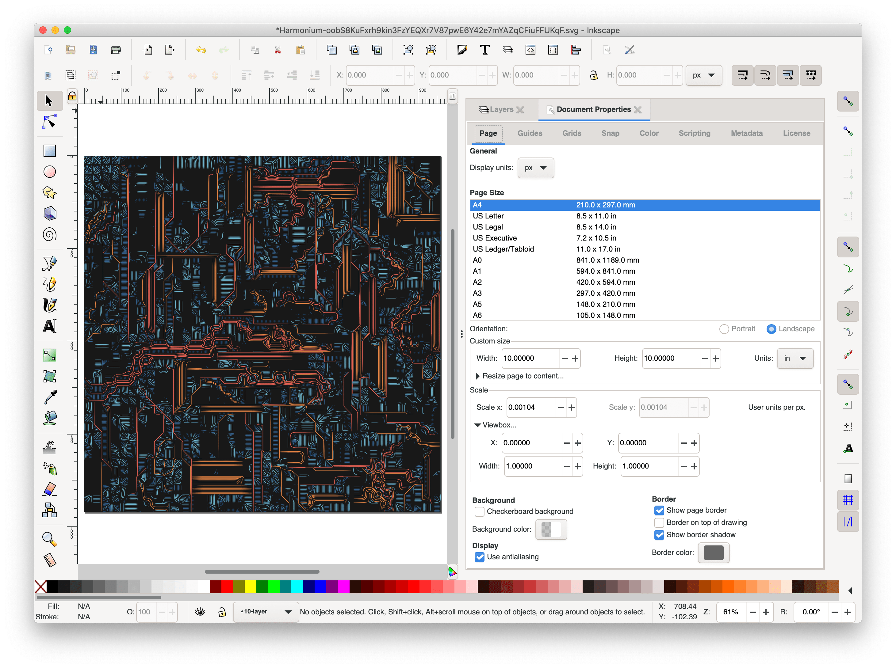
At this point you can plot and things should work as expected. I usually open the “Layers” panel so that I can plot different layers in whatever order I feel is appropriate (sometimes omitting layers entirely). Depending on the palette used in the image, you may have between five and twenty different layers.
An example Inkscape session with several layers hidden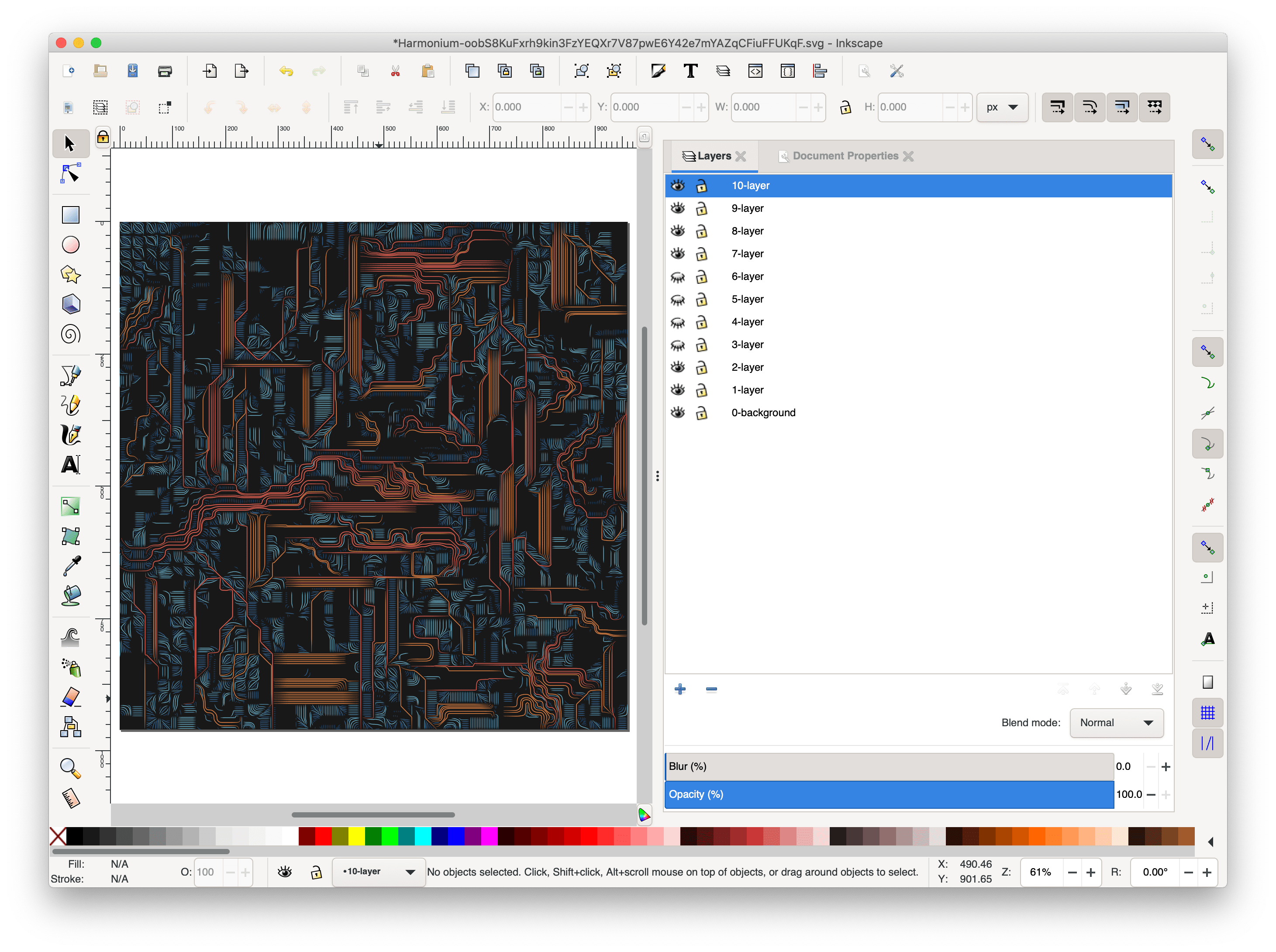
If you do plot any Harmonium images, please let me know! Have fun!
Technical Miscellany
As a final bit of information, here are some technical items that may be of interest:
- The results of evaluating field equations are cached so that they can be reused as new streamlines are created. Since the process of integrating streamlines repeatedly samples nearby points in the field, this sped up rendering substantially by reusing about 99% of calculations.
- Harmonium is a Svelte application, which made it easy to create various canvas and SVG components, allowing me to swap between them on the fly. I’ve been using Svelte for all of my recent web development, and I highly recommend giving it a try.
- I make heavy use of the Thi.ng libraries, and I am especially grateful for their focus on performance. I was able to remove most memory allocation during vector operations in the core integration loop (there are a lot of them, so this helped quite a bit) because that was something that the library provided directly.
- I had a major issue during development that was causing the same seed to render differently in different browsers. Ultimately this turned out to be a numerical precision issue that I was able to fix it by consistently truncating floating point values to ensure that this error accumulation and divergence didn’t happen.
Thank You!
Thanks so much for taking the time to read this post! If you have any thoughts or feedback you’d like to share, please feel free to contact me on Twitter or directly on this site.