Once I completed my interactive Git history, I started to think about a smaller visualization project that would allow me to experiment with new ways of visualizing development histories. I was looking through some photos of naturally occurring phenomena for inspiration, when I came across this image of particles moving in a cloud chamber:
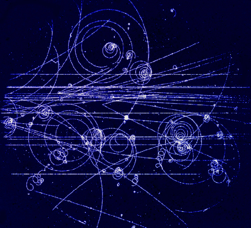
“Trajectories in a Cloud Chamber” Image from Gordon Fraser/CERN (CC BY 4.0)
There was something about it that sparked an idea in my head: “What if developer changes across the history of a source repository could be represented like this?”
I started brainstorming possible transformations to the git source repository domain (author, date, number lines added/deleted, etc.) that might end up with a structure that was visually similar to that of particles in a cloud chamber. I considered simulating particles with forces over time, gravitational effects, etc. Nothing was off of the table.
I eventually decided to start with a basic mapping, to try to get a sense of how that would look. (I can never never really guess how complex visualizations will look without seeing something based on actual data.)
My basic mapping algorithm looked like this:
- Create a point for every contributor, starting in the center of a two-dimensional space
- For every contributor’s commit (in date order):
- Move that contributor’s point according to:
- The date of the commit = a direction around a radial timeline, potentially inverting the direction based on timezone offset
- The number of lines changed = distance to move
- Create a dot in this adjusted position
- Move that contributor’s point according to:
So basically every commit would “push” a contributor point around in 2d space.
My guess at the beginning was that I would need to use some type of curve interpolation to make things interesting. I was expecting to need Bézier curves to make things look gracefully organic.
When I rendered a first version (based on the Git VCS project history), this was the result:
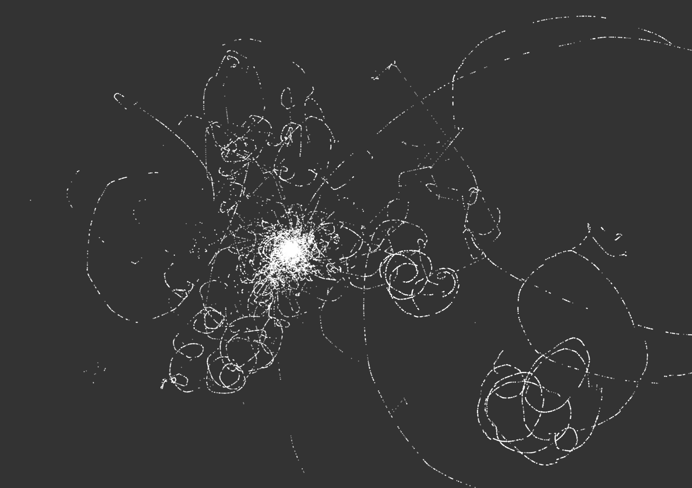
That was a lot more interesting than I had expected!
And, as a bonus, it actually seemed to have some of the organic feeling that I associated with the cloud chamber images that got me started. I decided to put the other more complex mapping strategies to the side to see where this simple version would lead.
The first change that I made was to spread out the origin points for each contributor, based on the date of their first contribution. I decided to lay out these points on a circular timeline, because I’m a sucker for round visualizations.
I also realized that I needed some way of introducing color, but I wasn’t sure yet how to do that. As a first attempt, I sorted the contributors by number of lines changed and then used that to apply a simple linear color scale. Surprisingly, it wasn’t terrible.
Okay, so at this point the visualizations were looking like something that might actually come out of a cloud chamber, so I decided to add some controls to allow me to tweak the various parameters that shaped the rendering.
Once I added these controls I realized that I needed to spend some time optimizing my code. The rendering was taking a very long time in-between changes, making iterative refinement a challenge.
I spent some time looking into what was going on and realized that the quick hacks that I had used to assemble the first version were not scaling to the larger repositories that I was actually working with. I had to do some rethinking of how the render positions were calculated, and I also moved to using HTML canvas to avoid creating hundreds of thousands of DOM elements during SVG rendering.
I then changed the color mapping to be based on the age of the commit, relative to “now,” so that newer commits were brighter and older commits faded away over the course of the project history, which worked well for animation (see below). With a little more tweaking and experimentation, I started to generate interesting results.
Here is the Kubernetes project history, with my standard render parameters:
Kubernetes (2015-2021) - Radial timeline (clockwise) - One rotation per year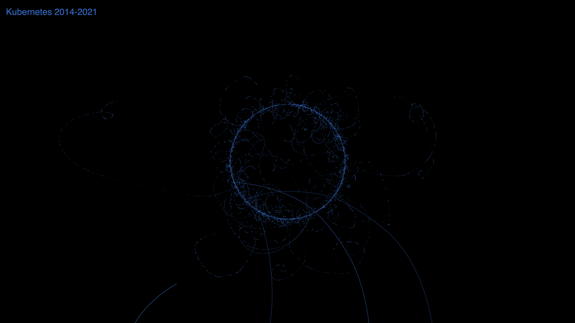
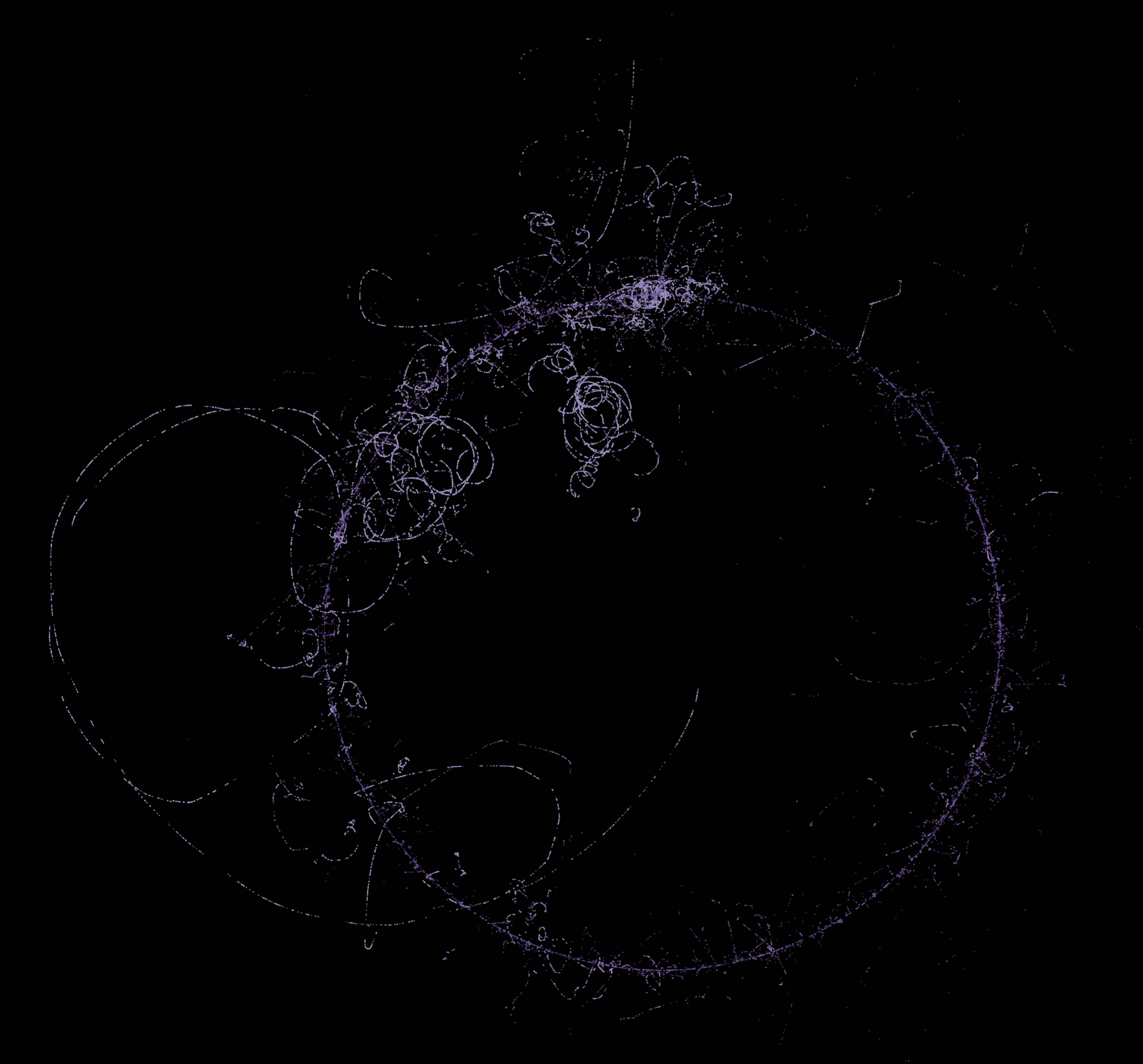
This is the Git project repository (one of my favorites), with the entire project shown as a single timeline rotation. The long looping structure on the right side is the project maintainer, Junio C Hamano.
Git (2005-2021) - Radial timeline (clockwise) - One rotation for entire project duration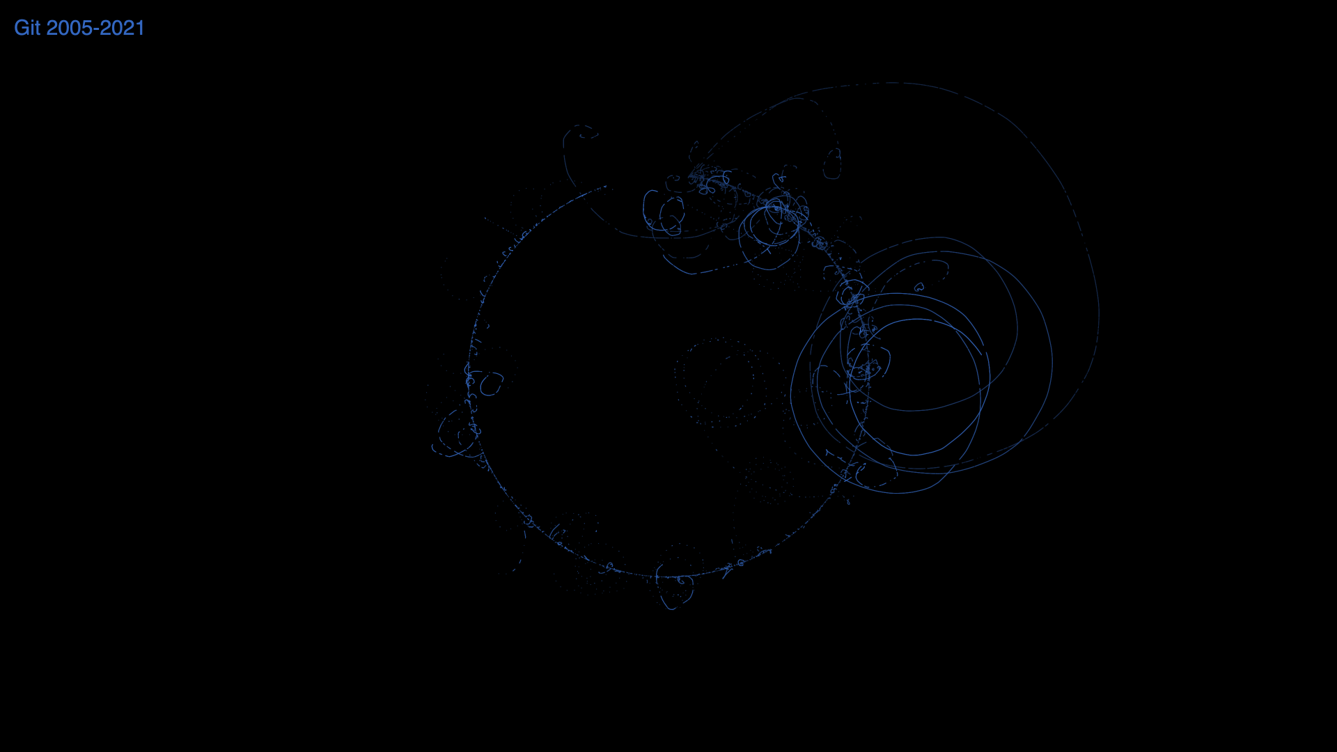
Here’s the TensorFlow project, but with the radial timeline replaced with a linear one:
TensorFlow (2015-2021) - Linear timeline (left to right)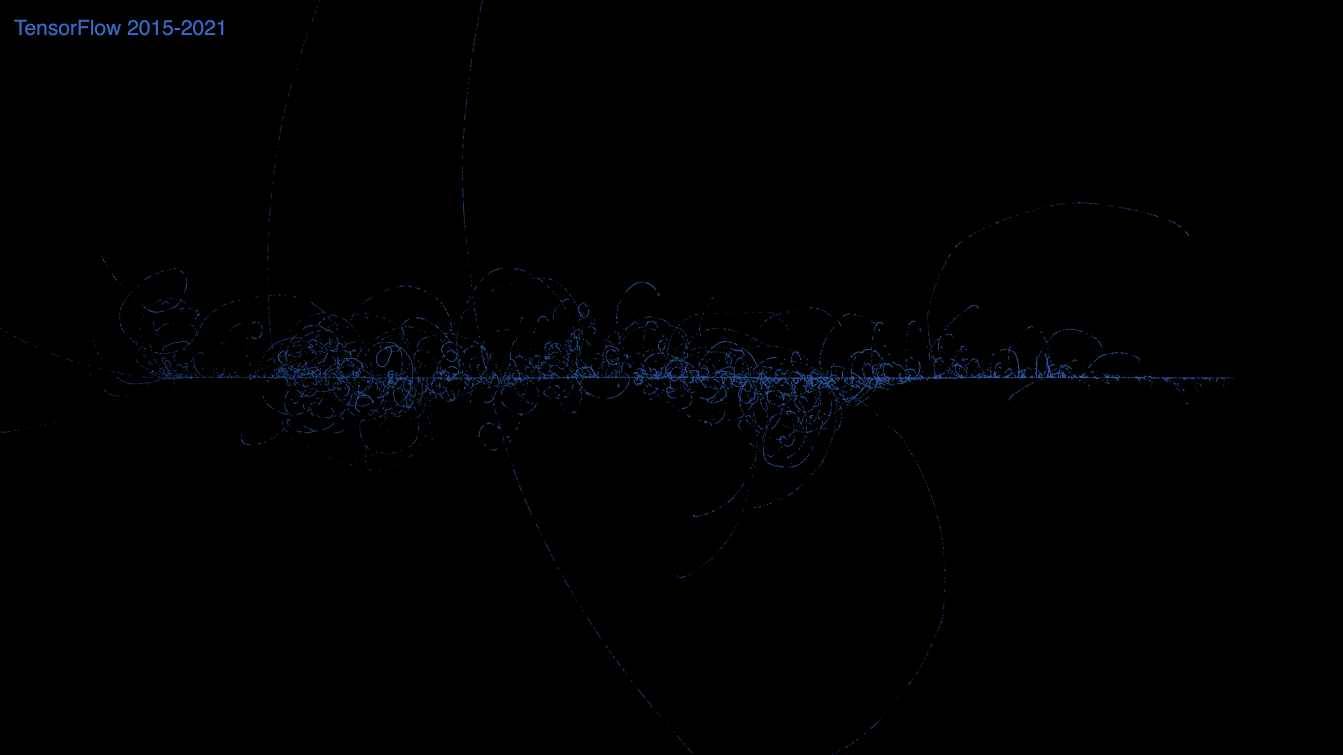
By reducing how fast the angle changes based on commit date, you can smooth out the contributor curve which leads to an interesting effect, especially with a repository the size of the Linux kernel.
Linux (2005-2021) - Radial timeline (clockwise) - Flattened annual commit date curves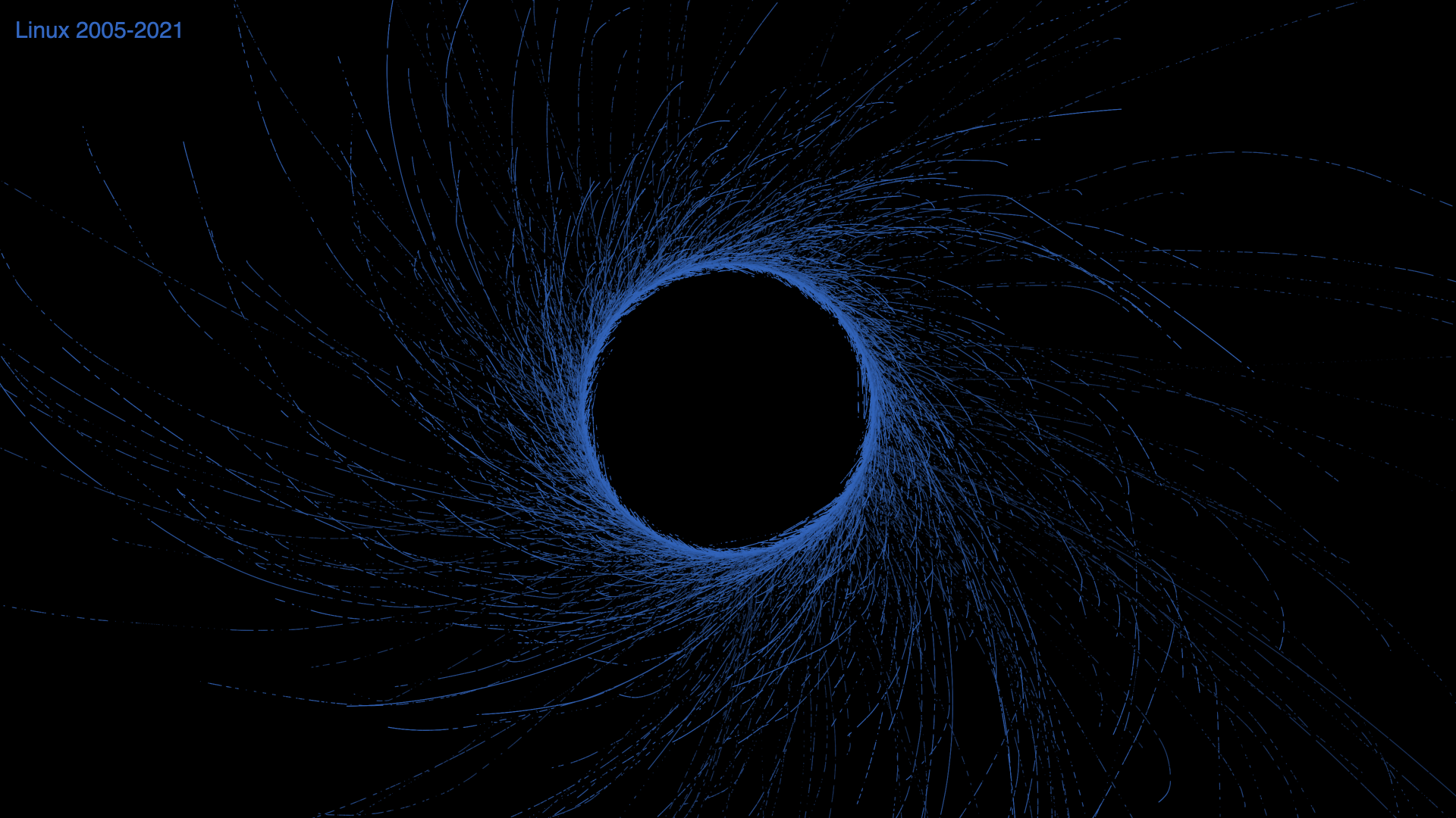
Finally, I thought it would be interesting to try to animate these, so that it would be possible to see the evolution of project histories over time. I had never created an animation from a canvas rendering before, but I figured that there must be tools out there that would make it easy.
It turns out that capturing an animation was more work than I expected. 😭
I started by further optimizing my canvas rendering in order to get silky smooth animations, but then I realized that I wasn’t able to capture 4k video at 60 fps while rendering in realtime. At that point I decided to create the videos frame-by-frame using the h264-mp4-encoder library that generates mp4 files directly from a sequence of frames. That actually worked really, really well.
You can see the final result of these efforts in the following video:
Thanks for reading! If you have any thoughts or feedback you’d like to share, please feel free to contact me on Twitter or directly on this site.