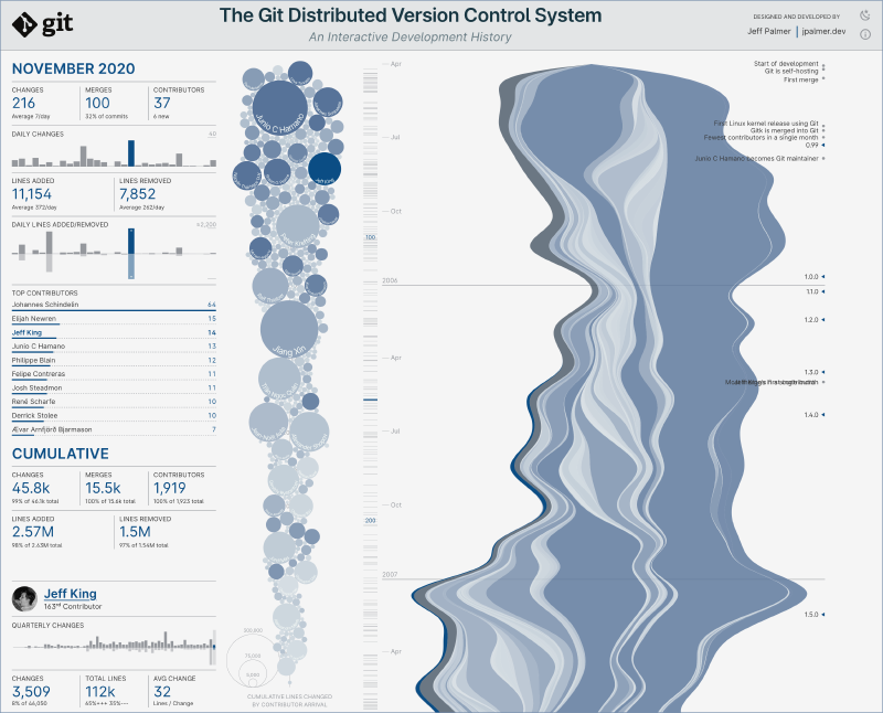
In April I set out to create an interactive visualization of the Git distributed version control system, and I’ve finally reached a point where it’s ready for others to see. Here’s a screenshot of the current version:
This became one of my larger projects, so I thought I’d share my experiences building it.
Motivation
Git is a distributed version control system that allows software developers to safely store historical changes and collaborate. Version control is a critical part of software development, and the introduction of Git in 2005 has had a major impact on how teams manage software version history.
I’ve been around long enough to have developed in the world before Git, and have managed large source repository migrations to it from other tools. While it has its share of warts, like all tools, I’ve always found its abilities to far outmatch any difficult situations I’ve encountered. As a way of saying thanks to the Git community, I wanted to build something to recognize the efforts of the open source contributors that have turned Git into what it is today.
At the same time, I had been creating static data visualizations from software development data and thought that I should try to create something that was more interactive. I had recently read Data Sketches, by Nadieh Bremer and Shirley Wu, and was inspired by the stories behind the creation of their (often complex) interactive visualizations. Their experiences felt very close to mine, but they had pushed to an interactive end product, whereas I had yet to do so.
So, I decided to expand on my previous exploration of the Git development history and create a tool that would support the interactive exploration of the history of Git’s development.
Goals
In the past when I’ve seen visualizations of development histories, they tend to be things like force-directed simulations of module evolution over time, or contributor graphs like those provided by GitHub:1

And, while these are interesting, they’re not quite what I had in mind. I was hoping to create something that encouraged interactive exploration of the data, providing additional details depending on what was selected.2
To get things started, even though I didn’t have a concrete idea of what I was going to build, I decided on the following project goals:
- Provide some type of visualization of the entirety of the development history
- Allow specific developers to be selected to understand their efforts
- Provide interactive point-in-time and cumulative statistics
- Show developer geographic distribution
- Annotate the timeline with historical project milestones
These provided some direction to my overall goal, which was to experiment with alternative ways of visualizing development.
Visual Inspiration
I started by doing an exploration of existing visualizations as a source of inspiration. Here’s a sampling of the many great ones that I found:
- Paul Button’s Items of Interest
- Josh Gowen’s The Data Double
- Mike Bostock’s 2018 Box Office
- Susie Lu’s Strong Openers and Late Bloomers remake of the NYT original
- Many, many of the works from The Pudding when it comes to telling a story with data
With these ideas in my head I started gathering data.
Getting the Data: Part One
Before I could do anything I needed to convert the Git project commit history into something that I could work with. Getting the Git repository was the easy part, thanks to the very nature of how Git works. Once I had the repository, I then needed author, time, and size data for every change (there were around sixty-two thousand changes in the project history at that time).
Somewhat surprisingly, there wasn’t an “out-of-the-box” way to export commit history that included the number of files changed, as well as total lines added or removed. You can get use git log to get something close, but I wasn’t able to find an incantation that provided the detail that I was looking for in an aggregated way. I ended up building a quick ruby script to parse the output of git log, aggregating file change details so that for each commit I’d have total files changed, lines added and removed, in addition to the other commit data like author, date, tag, etc.
I also looked into using git annotate on the entire repository to understand the historical ’legacy’ of various lines of code, but that turned out to be cost prohibitive to run for every commit. I decided to generate this information for the start of every year as a starting point to understand if there was anything actually interesting there.
Exploring the Data
As I’ve mentioned in the past, my visualization workflow usually starts in Observable. Their reactive notebooks make data exploration really easy. I generally upload the data, parse and transform it as necessary, and then use the Vega Lite API (probably Plot soon) to interactively graph and explore the dataset.
I started by trying to understand how contributors and contributions changed over the life of the project. For example, this chart shows net lines of code changed per month by contributor for the top 10% of contributors over the entire project:

The sorting is sort of arbitrary, but you can see Linus Torvalds (he created the very first version of Git) at the top, with Junio C Hamano next (the project maintainer - he’s been very, very busy!). You can also see that there’s been a pretty consistent stream of new major contributors over the entire life of the project; active development has never really slowed down that much.
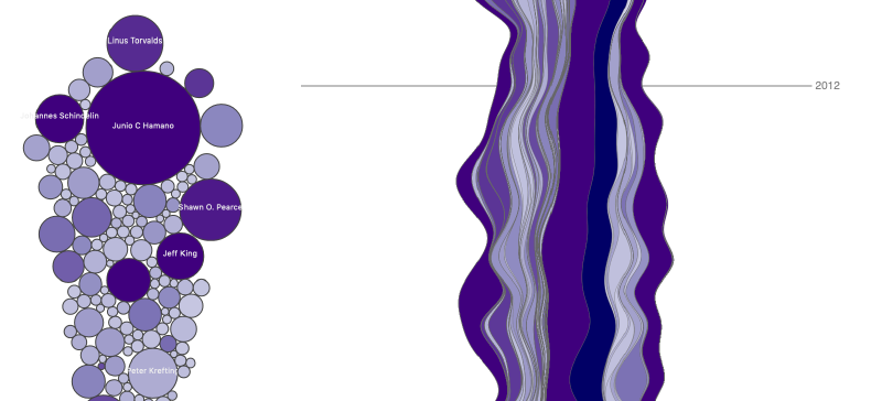
Next I thought I’d created a stacked area chart showing contributions over time:
Early stacked area experiment
That was interesting. You can see overall periods of activity increase, and how individual contributors participated over time. It was during this investigation that I came across the notion of a streamgraph, which seemed to present the data similarly while using some additional logic to improve the aesthetics of the final visual.
The problem with both the stacked area chart and the streamgraph is that they make comparing quantities difficult, but for this visualization my goal wasn’t to be able to accurately discern who had more changes in a single month - I was interested in presenting the project history in a way that encouraged interaction. The streamgraph felt like it might support that goal, so that’s what I decided to use as the main history navigation element.
Finally, I took a look at how code “ownership” had changed across the entire repository based on the yearly Git contributor ’legacy'git annotate output.

While that was interesting, it wasn’t really that surprising. It seemed natural that ownership would dilute over time as more people participated. I decided to shelve that data for another day.
Imagining the Layout
At this point I started sketching (yes, on paper) what the overall layout might look like. In my mind I knew that I wanted a static sidebar and a scrollable timeline that would provide a way to select project time periods. Statistics about the currently selected person or time period would be in the sidebar, and I was hoping to also have a globe or map that showed the distribution of developers for a selected period of time. (I had never created any type of choropleth, so I was interested in giving that a try, if possible.)
I was also hoping to have a way to see zoomed-in views of the timeline so that I could highlight the first several weeks, etc. I didn’t have any idea how to lay that out, so I did some exploration of scrollytelling to see if that might work. Ultimately I decided not to go down that path, as the scrollytelling approach was so completely foreign to me I had no idea how to fit it into the interaction model I had in my head. I will definitely return to it, however, when I have a more focused story to tell, as I think it can be really compelling.
Finally, I began to consider using circles to represent total contributions for a contributor. I had the idea of animating contributor circles as various time periods were selected, perhaps with a force directed simulation. I had no idea whether or not that would work/be a good idea, but since I was brainstorming at that point it all went on the list.
I came up with a rough three column layout, with the leftmost column for statistics, the contributor circles in the center, and finally the right column dedicated to a scrolling timeline streamgraph that would also somehow support annotations. With that loose structure, I was ready to start.
Let me add one caveat to all of this - I am not an experienced frontend developer. Development of modern browser-based applications, especially regarding how to make a visualization responsive and accessible, is a real challenge. I lean very heavily on the tools that I use to help me with these areas, to the extent that they are able. I am also not a visual designer, which further complicates projects like this. All that is to say that if you notice anything that could be improved, please let me know. I am very open to feedback.
Tools and Libraries
I have been a fan of Svelte for a while now, and I’ve also been experimenting with TailwindCSS, although when using Svelte the benefits aren’t as obvious. I ended up using it mostly for the structure it provided regarding font size consistency, spacing, etc. I also decided to try experimenting with Vite once the SvelteKit project moved over to it. I had been using Snowpack, but after a quick experiment and learning that it still used Rollup under the hood, I decided to try it.
In addition to the frontend tech used to structure and build the site, the visualization was all done in (unsurprisingly?) D3.js,3 while all of the data transformation was done in Arquero. Arequero is amazingly performant — I went into this expecting to have to pre-aggregate all of the data, but Arquero was fast enough that I haven’t yet needed to do that.
Getting the Data: Part Two
As I started building the site, I realized that I wanted to do two things to further cleanse/prepare the data:
- Remove all email addresses from the source data set and replace them with unique ids.
- Retrieve GitHub account information for contributor avatars and locations so that I could create a high-level contributor map.
The unique id was required to be able to unambiguously refer to contributor data once everything was loaded.
I wanted to remove the email address information because that just seemed like the right thing to do, even though that information is available directly in the Git repository.
Getting useful GitHub account information was a little more of a stretch. First of all, GitHub account information isn’t available when you retrieve commit data via the GitHub REST API, so you have to find some other means of getting it. I ultimately realized that GitHub provides detailed information for the top 500 contributors to a project, which seemed like a decent starting point since I wasn’t planning to show all contributor data (for performance and legibility reasons).
Ha ha, joke’s on me. Turns out that the GitHub account information is completely divorced from the reality of the Git repository emails, etc. This makes sense, as the Git repository history represents fixed information from a point in time (email address, name, etc.), whereas GitHub is a service that people keep up-to-date. As a result, there’s no “easy” way to join these data sets, and I was forced to join them by hand using commit counts, email matching, etc. I only tried to match up the first 250 contributors, but even so, that was not a fun afternoon.
Once that was done, I realized that out of almost 2,000 contributors, I could get location information for maybe 5%; almost no one had any location data in their GitHub profiles. Well, that was that — the idea of creating a map of worldwide contributor distribution was a non-starter. At least I could show contributor avatars for my trouble.
To minimize data duplication, I wrote a node script that used Arquero to load both of these data sets and join them, generate unique ids, and then write them back out as normalized data that would be re-joined in memory at runtime.
Challenges
I bumped into several issues while putting everything together. Most of the visualizations were pretty straightforward to create, but the two that caused the most grief were the streamgraph and the contributor circles.
Streamgraph
The streamgraph consists of two main parts: the visualization of contributor activity, and the timeline annotations.
Getting the data into the streamgraph wasn’t so bad (after browsing some Observable examples), but I quickly realized that it wouldn’t be possible to represent all contributors as separate curves without bringing the browser to its knees.
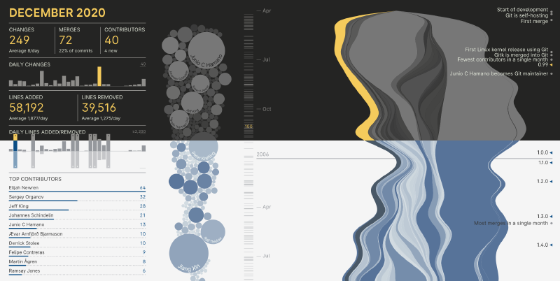
I decided to segment the contributors into two groups: the top 20% of contributors by commit volume, and everyone else. The top contributors would be represented directly, while the remaining contributors would be aggregated and displayed as a single “Other Contributors” band. This is unfortunate, but at the time I couldn’t think of another way to address the issue. It’s possible that I might be able to make things more performant by using Canvas, but that wouldn’t change the fact that the small 80% contributor band would be comprised of about 1,600 contributors. That seems like an unmanageable number of details to put into a small space without some type of zoom-based interaction.
The timeline annotations were also a challenge because it’s possible for two milestones to overlap, and I don’t have any logic for handling that. One possibility is to aggregate milestones when they overlap, but I haven’t yet had a chance to try that out.
Contributor Circles
During my research into force simulations in D3, I came across the idea of configuring the simulation such that a circle is attracted to a certain point on a timeline, but is free to move in the other dimension. I thought that I’d try to anchor the contributor circle to the date of the contributor’s first contribution, and the allow the simulation to move contributor around until things stabilized. I’d also increase the size of the circle to represent cumulative lines of code changed by contributor, so that the farther in the timeline you went, the more that a contributor’s circle would expand to represent overall project contributions.
I did try animating the circles when time period changed, but for some reason I wasn’t able to get them to settle down into a stable configuration, so I went with the approach of running the simulation without animation and simply showing resulting positions after 500 iterations. That seems to work okay, but I’d like to revisit the animation at some time in the future, even though my gut tells me it’d probably be very distracting.
The other issue I faced with was putting labels on the larger contributor circles. For a while I toyed with the idea of centering the name in the circle, but because SVG text elements don’t wrap, getting them to look reasonable was difficult. I ended up using SVG textPath to curve names around the bottom of the circle (but had to avoid the path part of the spec since it wasn’t supported by Chrome, Edge, and Safari).
Color Palettes
I ended up creating several color palettes during development, which was perhaps one of the most difficult parts of this entire project. When I started, the color palette was based on D3’s interpolatePurples, which was fine for prototyping but wasn’t anything I was going to be able to keep:
After many, many iterations I landed on a light and dark mode palette that didn’t seem terrible. You can see how they turned out below:
Mobile
Once all of the layout and charting was completed, I decided to see how things looked on a mobile device. Not surprisingly they weren’t great. I had designed an interactive visualization that was meant for a desktop style of interaction, a fact that was obvious if you tried to use a mobile device to do anything. I tried to add some code to handle smaller resolutions - one of the biggest challenges was getting the SVG elements and HTML font sizes to align depending on the size/aspect ratio of the viewport. That wasn’t great, so I ended up putting a warning on the site if you visit from a small-ish device resolution, but with the ability to proceed after the disclaimer. I would like to revisit how to redesign to support mobile in the future.
What’s Left?
Even though I had some issues during development, I am generally happy with how this initial version turned out. I’d like to be able to solve the timeline annotation spacing issue, and I think I have an approach to do so in my head.
What I’d really like to add, however, is a more comprehensive set of project milestones. I’d really like this to be useful as a way to understand important aspects of Git’s development history, but at this point I haven’t been able to capture a lot of milestones outside of the ones that can be directly derived from the data.
With that in mind, if you have any interesting information on the history of the Git project that you believe would make an interesting milestone, please don’t hesitate to contact me and I will happily consider adding it.
Thanks!
…for taking the time to read a little about this project. If you have any thoughts or feedback you’d like to share, please feel free to contact me on Twitter or directly on this site.
Which appear to be incorrect, now that I’m actually looking at them. 😬 Junio C Hamano is the third Git contributor, but in this chart doesn’t have any recognized contributions until some time after 2007-ish. I assume this is due to the mismatch between GitHub accounts and the identities in the Git commit history, which I’ll cover in more detail later. ↩︎
I find the GitHub visual presentation of historical data to be particularly lacking, as it immediately segments the data in a way that makes it hard to understand as a whole, while providing almost no tools for further investigation. Honestly this seems like a missed opportunity for them, but I am obsessed with this stuff so maybe I’m the outlier. They have so much historical development data available to them it would seem like an interesting path to explore. ↩︎
As an aside, I’ve seen some online opinions stating that D3 is not a good choice for visualization in 2021, and while I do agree that if you’re putting basic charts on a page it’s probably overkill, for anything of any complexity it’s really an amazing toolkit. The key is to treat it as such. Amelia Wattenberger and Russell Goldenberg cover this well in their recent Svelte Summit talk: Declarative Data Visualization: Creating a bar chart race. ↩︎