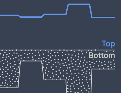
Nicholas Felton’s 2013 Annual Report contained two distinct histogram variants. This post covers how I created the second variant, which looks like this:
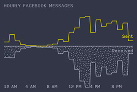
Histogram (Variant 2) detail from 2013 Annual Report (Nicholas Felton)
This is similar to the first variant that I covered in my last post, with the following changes:
- Two measures are plotted on the same x-axis, with their y-axes facing in opposite directions
- Irregular stippling is used to differentiate the lower measure
- Measure series labels are added, while value labels are removed
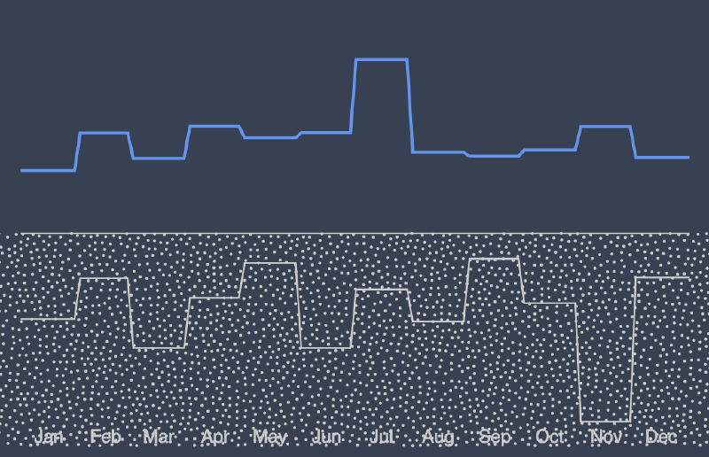
Plotting with Multiple Axes
This histogram variant adds a second measure that has its y-axis pointing downward, in opposition to the y-axis of the top measure. Since the y-axis in SVG increases from top to bottom, the range of the top scale will be from the y midpoint to the top margin (from x-axis upwards), and the range of the bottom scale will be from the y midpoint to the height minus the bottom margin (from x-axis downwards).
| |
With these scales, the same line drawing techniques from the last post can be used to create the two measure lines.
First, the line paths were created using the generateFeltonLine method:
| |
Then they were placed within the SVG along with some CSS classes for styling:
| |
Note: Much of the boilerplate in the code has been omitted to keep things short. These omissions are represented by ... in the source snippets. See the GitHub repository for the working implementation.
Generating Irregular Stippling
The original histogram used a form of stippling to differentiate the bottom measure from the top measure. My goal was to find an algorithm to generate realistic-looking stippling, generate a polygon that represents the area to be shaded, and then use the polygon as a mask to determine which points should be shown.
Aesthetically pleasing random point distribution
It turns out that generating stippling that looks good is actually somewhat difficult. Luckily I was able to lean on the community to find an existing implementation of Bridson’s Algorithm, which can be used to approximate human stippling. Thanks (again) Mike Bostock!
I added a version of this generator function to my code and was able to use it to generate a set of points like so:
| |
(The actual radius value of 10 that I used was the result of some visual trial and error.)
If you were to plot these points without any filtering, you get this:
Stippling without polygon containment checks
The stippling looks great! Now we just need to get rid of everything outside of the measure area.
Creating the bounding polygon
Unsurprisingly, D3 has the ability to perform polygon containment checks out of the box via polygonContains. Since I had already created a function to generate the set of points that constitute the measure line, creating a polygon from those points was straightforward.
| |
Once the polygon was created, it could be used to filter the point array.
| |
At this point, the filtered histogram looked like this:
Stippling after implementing polygon containment checks
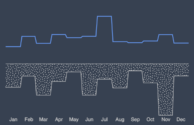
Adding Labels
The final step was to add measure labels above and below the x-axis:
| |
Unfortunately the lower label was somewhat obscured by the stippling: Measure labels - detail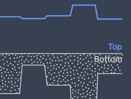
I experimented with CSS-based text shadows in an attempt to create an outline that would mask the nearby points, but that didn’t work as well as I hoped it would. I did a little more research and eventually came across an article describing the feMorphology filters available in SVGs. (It’s still amazing to me what’s built into SVG!)
These filters can be used to define a series of image transformations, which in this case were used to implement a very clean text outline (see the linked article for a detailed description of how this actually works).
| |
Once the SVG text elements were altered to include a reference to the filter via filter="url(#outline)", the label text in the stippled area became significantly more legible:
SVG text outline via feMorphology filters - detail
Final Result
At this point, the final version of the histogram was complete:
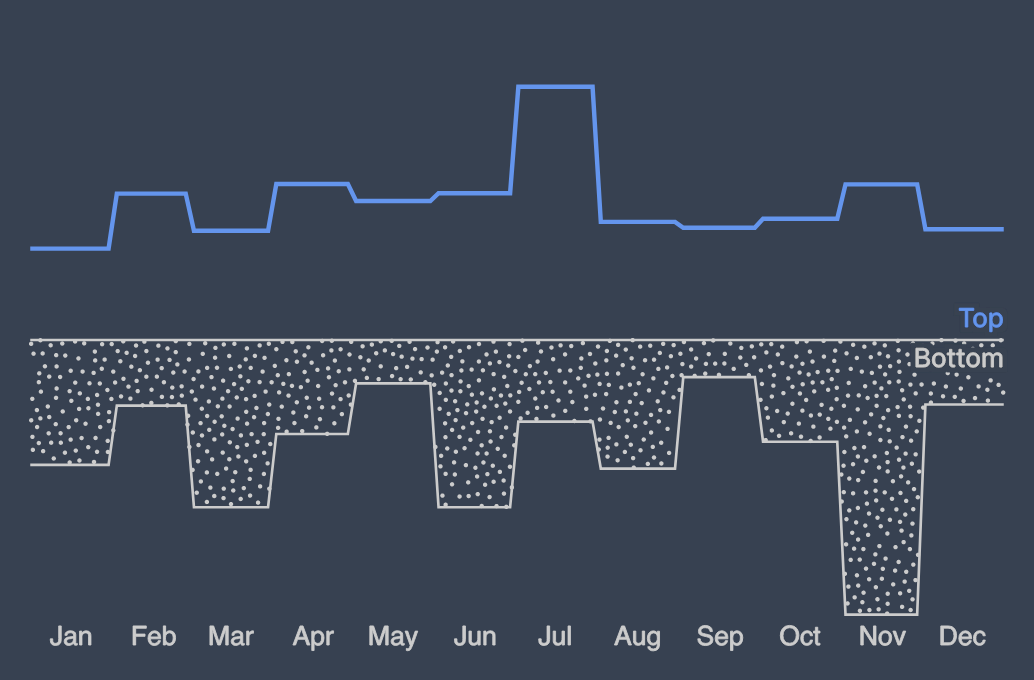
Final histogram version - Variant 2
The code I used to write this post is available on GitHub.
If you have any feedback, please let me know on Twitter or feel free to contact me here.