At the end of January I tweeted out a visualization that I had put together over the course of the preceding week to celebrate Visual Studio Code Day:
2020 Visual Studio Code Year in Review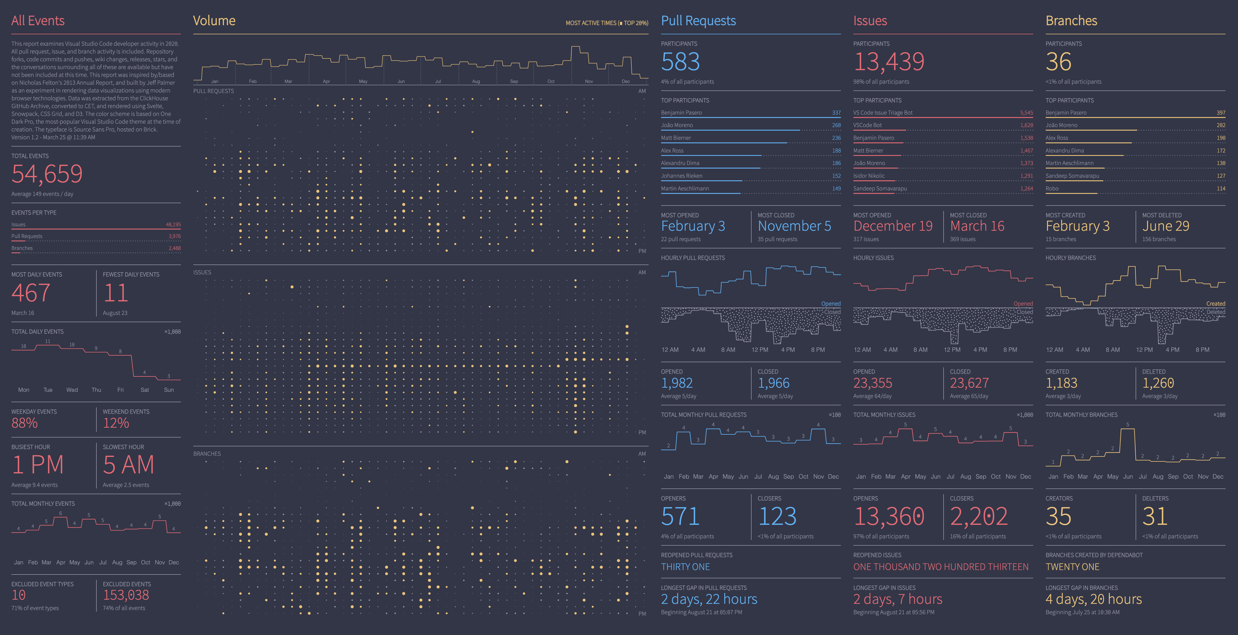
I received some positive feedback from the community, which was really great, and I also got some questions about how I’d made it. I promised to provide more detail in a blog post (on a blog that I didn’t actually have 😆), so here we are. Better late than never, I suppose.
In this series of blog posts I’m going to cover why I made a 2020 VS Code Year in Review visualization, the inspiration behind it, the tools I used to build it, and some of the finer details of its construction. I hope you find it interesting!
Motivation
At the beginning of the year I was thinking about starting a new project that would allow me to experiment with a bunch of different technologies that I had been interested in. Specifically, I had been using Svelte for the last year and had really enjoyed it, and after watching Paul Butler’s YouTube series about combining D3 with Svelte I was eager to give it a try. Additionally, I had just heard about CSS Grid and thought that might be interesting to experiment with as a framework for structured visualizations.
I had also just read Everything You Ever Wanted To Know About GitHub (But Were Afraid To Ask)1 and was excited by the prospect of digging into that dataset. The idea that the entire GitHub Archive dataset was available in a ClickHouse database that could be easily queried via SQL seemed too interesting to pass up.
Finally, over the past year I had learned to love Visual Studio Code and had been using it daily (sorry Emacs!). After learning that VS Code was one of the most active open source projects on GitHub, I thought it might be interesting to use that project as a lens into the GitHub dataset. Once I started digging around I realized that Visual Studio Code Day was on January 26th, which left me about a week to pull something together. This timing seemed ideal, and at the same time doable, so I set that as my deadline.
Understanding the Data
Before I started coding I took a look at what data was available in the ClickHouse GitHub Archive. I wanted to be able to get data directly from ClickHouse and avoid having to write a bunch of glue code to pull in information from other sources. (For example, I thought of some really interesting git commit history metrics that could be surfaced, but they would have required the processing and integration of data outside of ClickHouse.)
At the end of the Alexey’s article there’s a section on how the data was processed and loaded. All of the GitHub events that were captured are described, as well as how they were mapped to the ClickHouse schema. I ended up choosing three types of events that all GitHub users would be familiar with:2
- Pull Requests
- Branches
- Issues
Pull requests and branches seemed interesting as they’re the meat and potatoes of how work gets done on GitHub and have a direct relationship with code contributions.
Issues, on the other hand, seemed like another story. I took a look at the VS Code repo and saw that they had 4.4k issues open, and over 100k closed! That is a ton of issue volume, and I was a little worried that there I was dealing with garbage data of some kind. Then I realized that, even if there is some bot activity causing those bug counts to be so high, that’s the reality of the project. So, issues it was.
Timezone Considerations
I started by writing some ad-hoc SQL queries to understand data distributions across these events and to look for any oddities in the data. Part of this was to understand who the top contributors were, and how activity was spread across the hours of the day. It became pretty clear that I was likely dealing with a timezone-related issue, as the majority of project effort seemed to be happening in the middle of the night (according to my timezone, at least).
Once I took a look at the profiles of the top project contributors I noticed something. For example, Benjamin Pasero, the primary Pull Request participant in 2020, had the following information on his GitHub profile:
I am a software engineer at Microsoft in Zurich, Switzerland since 2011. Our team started VS Code when it was still called Monaco.
Okay, so it seemed likely that a large part of the team was in Europe. That would explain why the hourly workload appeared as it did. I re-pulled the hourly data, this time converting to CET during aggregation. The results looked a lot more like a normal workday, so I decided to use CET as the primary timezone for all data. Luckily ClickHouse makes this easy.
For example, here’s the SQL to determine the date in 2020 with the most closed pull requests:
| |
At this point I knew that I’d be able to get whatever data I needed out of ClickHouse. Now I needed to figure out how to represent it visually.
Design Inspiration
So, I had a timeline and a number of technical goals that I wanted to achieve. Given the short timeline I knew that I wouldn’t be able to successfully apply several new technologies while at the same time creating a compelling and innovative novel visualization. I needed to find an existing visualization to use as a template for the visual structure.
The Felton 2013 Annual Report
I’d always been a fan of Nicholas Felton’s work focused on the “quantified self,” and in particular found his 2013 Annual Report to be particularly compelling. I thought that there was likely a pretty direct mapping between the communication metrics he presented and those that I could calculate for the VS Code software development process.
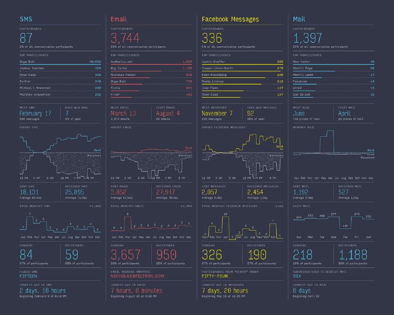
Detail page from the 2013 Felton Annual Report (Nicholas Felton)
Additionally, the report’s distinctive visual style would force me to pay attention to the micro-decisions that had made when during its creation, which would be a great way to structure my experiments with Svelte and D3.
Mapping the Specifics
With the visual framework established, it was time to take a closer look to figure out which parts mapped best to the GitHub data.
I decided to map the original data metrics as follows, using pull requests as an example:
| Original Metric | VS Code Metric |
|---|---|
| Total participants | same |
| Top N participants | same |
| Date with most interactions | Date with most opened PRs |
| Days without interactions | Date with most closed PRs |
| Aggregate send/receive activity by hour | Aggregate PR open/close activity by hour |
| Total sent | Total opened PRs |
| Total received | Total closed PRs |
| Aggregate activity by month | same |
| Total senders | Total PR openers |
| Total receivers | Total PR closers |
| Various type-specific metrics | Reopened PRs3 |
| Longest gap in interactions | same |
Getting the Data
At this point I knew what data I needed, so I started writing SQL. One of the benefits of one time development is that you can make a mess and not really care. Well, I certainly made a mess of my data retrieval code, but it got the job done.4
GitHub Archive Data in ClickHouse
Once I started getting query results, I needed to find a way to automatically save them to a format that could be easily parsed and integrated. It turns out you can write ClickHouse SQL statements that will save query results as JSON data:
| |
Which will generate a JSON file that looks like this:
| |
This seemed perfect until I remembered that I was running the ClickHouse client in Docker5 which meant that the generated files were ending up in the Docker container. Five minutes of Googling later and I’d remembered how to mount local directories in Docker and had added it to my wrapper script. Now my data was being written to a local data directory on my Mac. 🎉
| |
Ultimately this is how I obtained all of the data. Everything was saved off and then fed to TypeScript for parsing and further structuring/consolidation. Fine for a one-off, but as a result I couldn’t create visualizations for any other repository, even though I realized that that would be pretty interesting. I’ll likely revisit the data retrieval parts of this project in the near future to make that possible.
Augmenting User Data
As I mentioned earlier, I wanted to avoid writing a bunch of glue code to integrate data from other sources. In the end I really only needed to do this to transform GitHub usernames into real names (and I didn’t really need to do that—I just wanted the Top N lists to look a little more “human”). Given that I was only dealing with the top twenty-ish contributors, I ended up just doing this by hand using the GitHub /users/{username} REST API endpoint. I manually ran the Top N user queries and stored the responses in a map, which I then joined to other data as necessary via TypeScript.
Putting It Together
So at this point I had all of the data that I needed, and it was time to start building the visualizations.
CSS Grid
The layout heavy lifting was done by CSS Grid, which auto-sized the content in the All Events, Pull Requests, Issues, and Branches rows so that everything matched perfectly across columns. This was an absolute joy to work with, and once I got the initial structure into place I never really had to think about it again. I suppose most developers familiar with CSS are used to grids by now, but this was my first time using them and it certainly won’t be the last.
As an example, this was the css grid structure for the columns to the right of the Volume visualization:
| |
I then simply had to drop div elements into that container and everything flowed as expected. The only challenge that I remember having was wrapping my head around the column/row flow model at the very beginning. I found this guide to be a really helpful reference.
Svelte and D3
Developing these visualizations using Svelte and D3 was the bulk of my effort. There were a lot of lessons learned which I’m going to cover in a series of other posts:
- Implementing the Felton 2013 Bar Chart
- Implementing the Felton 2013 Histogram — Variant 1
- Implementing the Felton 2013 Histogram — Variant 2
- Implementing the Felton 2013 Volume Chart
Formatting Libraries
Aside from the visualization work done in D3, I used a couple of libraries to format some of the metrics:
- To Words: Converts numbers into words.
- Humanize Duration (TypeScript): Converts durations into words
For most everything else I used some variant of D3 number formatters or Date.toLocaleString and Date.toLocaleTimeString.6
Typeface
The typeface used in the report is Source Sans Pro, designed by Paul D. Hunt. I tried a variety of typefaces during development and found that I preferred the number styling of Source Sans Pro, especially the dotted zero. I enabled this via:
| |
In order for this to work as expected, I needed to use a non-Google typeface CDN due to apparent optimization on Google’s side. I ended up using Brick because they host unmodified versions that support OpenType features and have an elegantly simple API.
Color Palette
Finally, I thought it would be interesting to use the color palette of the most popular VS Code theme as the color palette of the visualization. It’s pretty easy to see themes ranked by installs, and at that time One Dark Pro was the most-installed non-icon theme.
Example of the One Dark Pro theme (theme site)
As it turns out the color palettes used in One Dark Pro and the original report are quite similar, so it was an easy mapping that ended up looking great.
Done!
With that last change everything was ready. I shared the result on Twitter, sending it out the night before hoping that it might get seen before things got started. Things were a little quiet until the next morning when someone on the VS Code team retweeted my message, at which point I got some really great feedback.
Thanks for taking the time to read a little about this project. If you have any thoughts or feedback you’d like to share, please feel free to contact me on Twitter or directly on this site.
Milovidov A., 2020. Everything You Ever Wanted To Know About GitHub (But Were Afraid To Ask), https://gh.clickhouse.tech/explorer/ ↩︎
I had hoped to include project releases as well, perhaps as an overlay on the various visualizations to provide additional insight into major project activities over the course of 2020, but I just wasn’t able to get something compelling completed in time. I’ll probably revisit that information in the future, as I feel like you can already see the build-up to major releases in the data, so it would be nice to be able to provide that additional context. ↩︎
There wasn’t an obvious “reopened” metric for branches, so I thought it might be interesting to see how many branches were opened by dependabot, the dependency management assistant that’s now part of GitHub. ↩︎
TODO: Fix data retrieval 😭 ↩︎
I forgot to mention that all of my data investigation takes place in Emacs, running sql-mode with the ClickHouse extension. This is a little wonky, and because I’m running on a Mac I needed this wrapper script to make things work as expected. ↩︎
I fully acknowledge that it is very weird to convert all data to CET and then choose to format all times with American AM/PM nonsense. My only excuse is that in the interest of time I discarded all locale considerations. 😬 ↩︎